The Gamasutra Deep Dives are an ongoing series that aim to shed light on how specific design, art, or technical features within a video game come to be, in order to show how seemingly simple, fundamental design decisions aren't really that simple at all.
Check out earlier installments, like this great Deep Dive on creating a new language forPlanet Coaster, or maintaining player tension levels in Nex Machina, and achieving seamless branching in Watch Dogs 2’s Invasion of Privacy missions.
If you're chiefly interested in Art Design Deep Dives, check out this great one on the hand-drawn art and animation of Jotun, and achieving seamless branching in Watch Dogs 2’s Invasion of Privacy missions.
Who: Gwenaël Massé, Artist at Motion Twin
Hello, my name is Gwenaël Massé, and with Thomas Vasseur, we're the two artists of the indie studio Motion Twin. Among others things, I’m tasked with designing the backgrounds of Dead Cells and I hope that sharing some insights on our production process may, somehow, help someone someday.
So, let’s get to it. We laid the foundations of the artistic direction of Dead Cells on three pillars: a saturated color palette, Celtic architecture and the theme of alchemy.
What: A saturated color palette in a cryptic locale
We chose to use highly saturated color spectrums for several reasons. The first would be the consistency between the gameplay and the art direction. Saturated backgrounds and characters really shine when it comes to keeping the player awake and alert, drawing the attention of the eye to any new element appearing on the screen.
This leads the player to have a better understanding of the action and consequently a faster reaction time when responding to potentially lethal threats. Which feels great for a game wanting to be as fast-paced as we want Dead Cells to be.
On a pragmatic level, we’re using as much vibrancy as we can, which means we focus almost exclusively on increasing the saturation of the midtones. Complementary palettes (composed of opposing colors) are great for giving a confined feeling to a space, which is why we use them a lot in the design of our interior levels. On the contrary, we put the emphasis on analogous colors for the outdoor levels as it allows for more nuances and depth in the landscape but, even there, we still use complementary palettes to highlight the difference between outdoor and indoor areas.
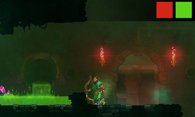 Complementary palette used on an indoor level (Toxic Sewers)
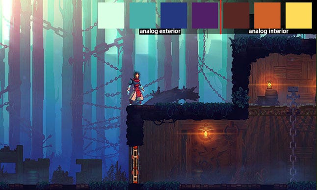 Analogous palette used on an outdoor level (Promenade of the Condemned)
Always saturated, but never welcoming
To keep the consistency between the Lore and the visuals, we apply this principle to each and every level. We always make sure to add some unsettling background elements, which might suddenly appear to the player paying attention to the background. We really like the contrast created when a peaceful, warm environment, somewhere you might even want to go on holidays, meets the gloomy tracks left by the abominations actually living here.
Why?
This idea can be seen applied from the very beginning of Dead Cells. In the first scene, the main character rises in a glow of warm light while the cadaver of fallen giant rests in the shadow of cold colors.
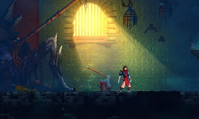 Starting scene of Dead Cells
Despite featuring zombies and developing a game where the foreboding sense of danger never really leaves you, we choose not to mimic the artistic direction of similar titles. For instance, highly contrasted and low saturated palettes are heavily used in Salt and Sanctuary or the Souls series, creating quite a dramatic atmosphere.
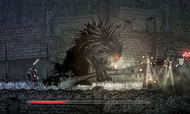
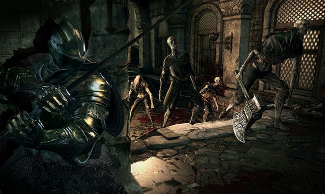 Random beautiful screenshots found on the Internet
While we understand the benefits of this design, we also wanted to add our modest contribution and new touch to the landscape of hardcore games. More specifically, we wanted to prove that a violent, cryptic ambiance, does not necessarily demand desaturated colors.
As such Dead Cells tries to ally the despair and feeling of fallen glory found in the remains of an ancient, triumphant, kingdom with a lighter tone, a colorful character and some strokes of humour. We wanted something that doesn't take itself too seriously. From an artist's perspective, saturation allow us to be graphically consistent with that desire. Flashes of brilliant sunlight juxtaposed against grim dungeons and falling towers, a beautiful forest and dappled light contrasted with bloodied traps and items of torture.
Of course the art direction also had to stand out from the crowd of comparable games. We wanted to say something like; “we can do difficult, we can do frustration, we can do that feeling of achievement when you beat a particularly difficult boss”, even though it’s happening in a strangely vibrant colourful world.
The underlying practical reason remains the fact that the contrast in colour pallets really just helps the readability of the game. Threats stand out and your reaction times are naturally better when you can clearly see what’s trying to kill you.
Lastly, when you start a project like Dead Cells you hope that you’ll be done in a year and a half, in and out, but you know, somewhere in the back of your mind, that this game is going to be your world, your day job, your after hours, you conversations for years to come… So you want to build somewhere that you’re happy to hang out for a long time!
Celtic architecture
The events in Dead Cells take place on an Island inspired by Skye Island in Scotland, particularly the architecture from the X to XIII centuries. Mainly influenced by Celtic Christianity, we chose this architecture as a reference to the cold and harsh nature of its old buildings as well as for other iconic features of this style, notably its basalt columns.
We tried to reproduce the troubling atmosphere established by these elements in Dead Cells, again, with the same idea of reminding the player of the hazardous world that their exploring. The more organic details of this architecture then serve as a link between this bleak setting and the occult side of Dead Cells’ lore: alchemy.
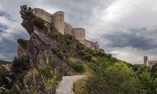 One of the photos used as a reference for the Island of Dead Cells
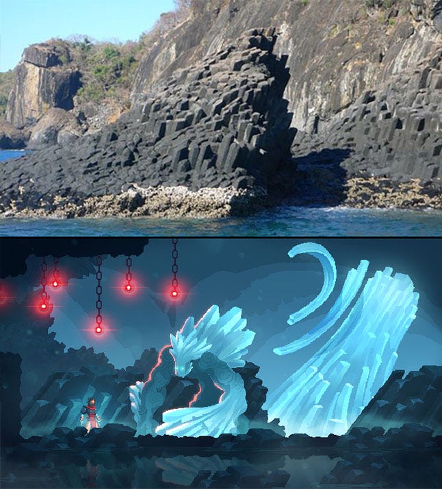 Basalt columns which inspired a concept art for Dead Cells
 You can see more photos used as references for the game here, if that’s your thing.
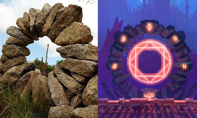
Alchemy and magic
This third pillar ties the whole thing together, the Lore and background, monsters, gameplay, biomes, etc. For instance, the Collector belongs to the magical aspect of Dead Cells and is a key element of the meta progression system, allowing the player to infer a little more about the world.
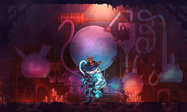
A very pronounced graphic charter, relying heavily on specific materials like copper, glass and magical runes allows us to convey the alchemic nature of the world to the player at the same time as drawing a clear distinction between the background and crucial gameplay elements (power upgrade, teleporter, chest, etc.).
These three leitmotifs form the foundation of the art direction of Dead Cells. On top of that, several rules tied to gameplay and technical limitations (legibility of the action, level design, camera, etc.) are then added over the base with the same old goal in mind: ensuring the consistency between the levels and a fluidity to the eye of the player.
Legibility of the action
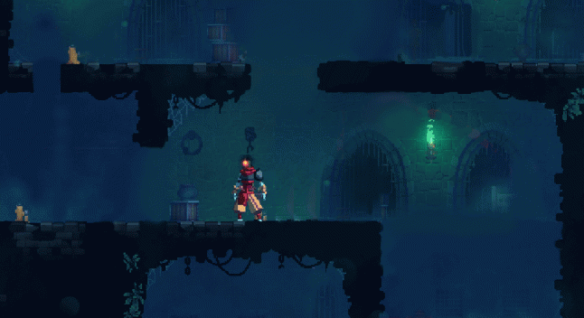
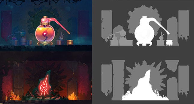
The fast-paced orientation of Dead Cells requires giving the player the opportunity and the ability to react quickly, failing which, the game would seem unfair and frustrating. To help the player “read” the screen easily, the visuals have to reflect the degree of importance of each information.
Our first concern is to properly indicate the possible ways of progressing to the player. In order to do that, the background of the levels and the collisions have to contrast as much as possible, while the colors used to design the background have to fade into each other, creating no discernible rupture.
After the collisions, the second thing the player must see is the various gameplay elements with which he may interact: ladders, platforms, etc. These have a degree of contrast somewhere between the backgrounds and the obstacles.
Finally, we need to make the player understand the potential threats, even if it’s an unconscious realisation. The enemies, their projectiles and any spells they may eventually cast are treated with high levels of saturation, contrast and brightness so the immediate danger is quickly identifiable.
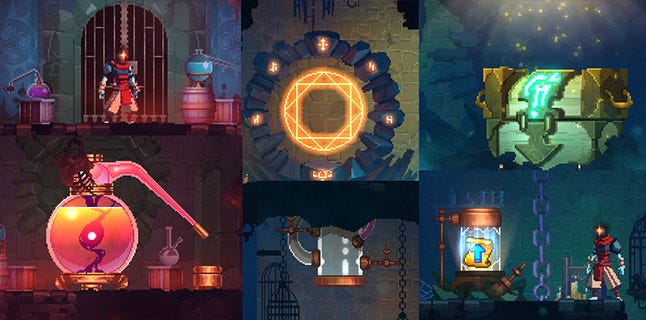
Keeping some consistency between the gameplay components
Some gameplay components are found in each levels, so they have to be recognisable by the player each time one of them appear on the screen, no matter the specific graphic charter of the level or if it’s an indoor or outdoor one.
To this end, we designed a specific visual language similar for all these gameplay components.
No tags.