So, Chrono Trigger just got re-released today on Steam. Aaaaand....
Square. Buddy. Pal.
We've talked about this:
Doing an HD Remake the Right Way
We've talked about this twice:
Doing an HD Remake the Right Way: FFVI Edition
For those of you just joining us, hi, my name's Lars, I'm some random indie game developer you've never heard of who made a random game you've never heard of, (out now on Steam and consoles!) and I have a lot of opinions about how to do HD Remakes the Right WayTM.
This is not to say that I think my own games' art styles are unimpeachable or that I'm so great, (far from it), just that no matter how small your budget or simple your approach, there are some well established best practices for presenting classic games in the best possible light, regardless of the player's subjective personal taste.
These techniques are cheap, straightforward, and easy to implement, and I'm giving them away for free!
But somehow, Square Enix, despite their comparatively unlimited resources and rich collection of history's most beloved RPG's, isn't getting the message.
Before we begin, this doesn't seem to be the fault of a "crappy mobile port" either. The original mobile version was released December 8, 2011, and has had a series of updates. According to the iTunes version history, Version 2.0.0 launched today, Feb 27, 2018, with this changelog:
Now available as a version upgrade!
- Updated graphics and sound.
- Improved controls and screen layout.
- Compatible with Apple TV.
- Compatible with gamepads.
- New autosave function.
- Compatible with cloud saves.
- New achievement function.
*Upgrade available free to customers who purchased the previous version
Which seems to be the same set of graphical "upgrades" that match the day-one Steam version.
Okay so, this is quick and dirty, and with the proviso that the original mobile version didn’t look fantastic itself. But here are a few comparisons of the iPhone CT and the new multi-platform CT.
— Shaun Musgrave (@ShaunMusgrave) February 28, 2018
In other words, at least as far as graphical presentation is concerned, the team that made the original mobile port may very well have had nothing to do with this. It's entirely the fault of whoever directed these most recent changes, which follow a clear pattern set by the FFV and FFVI HD remakes also released on Steam.
Shall we begin?
IMPORTANT NOTE:
If you're reading this on a phone, images might not be at the proper scale for you, making some of the points the article makes harder to grasp. Each image can be clicked for a full resolution version.
1. Thou Shalt Not Apply Filters Inconsistently
Those of you into the emulation scene might know about upscaling filters. I talked about them in the previous articles.
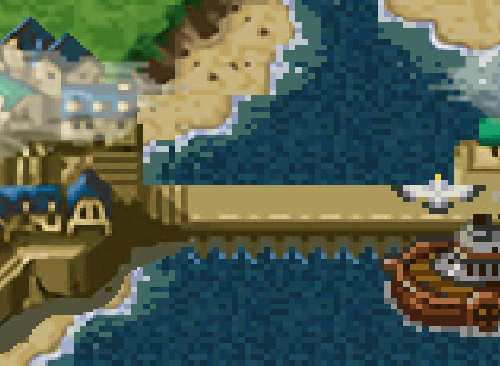
So on the original SNES, Chrono Trigger looked like this in terms of pixels sent to your TV:
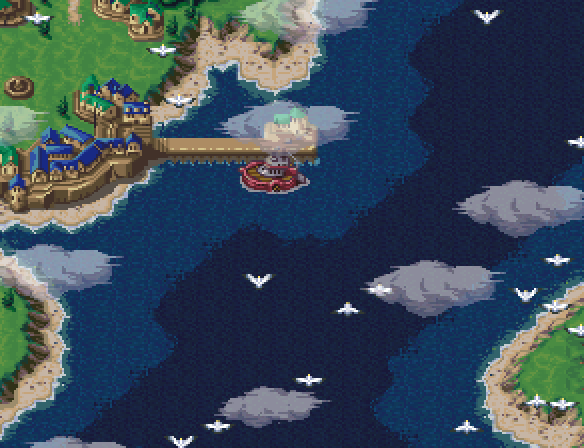
Of course, that's not exactly how you would have remembered seeing it. It's a matter of subjective taste whether you prefer 1:1 upscaled blocky pixels or whether you prefer the "classic look" with simulated scanlines, CRT color bleed, and even screen curvature. But we can leave that aside because instead of opting for either of these techniques (or even better: letting the user choose), they've again opted for the worst of both worlds.
Here's that detail shot again, from the Steam version's opening cinematic. And even though this is a cropped detail shot, this is not shrunk or scaled, these are the exact pixels on your screen:
Some elements are fully pixelated (the boat, the seagulls), some have an upscale filter applied (the houses in the village), and some are pixelated with a bilinear filter slapped on top (the clouds, which are transparent to boot). To top it off, scaling is inconsistently applied at a non 1:1 ratio - at 1080p resolution, the boat features pixels variably scaled at 7x5, 6x5, and 5x5.
Absolutely none of this is consistent, and does nothing to make the art look better than the original, regardless of one's taste.
Here's the boat from the SNES version, sized up to match. It's not a 1:1 comparison because the color model is slightly different, the birds and clouds are in a slightly different place, but you get the idea.
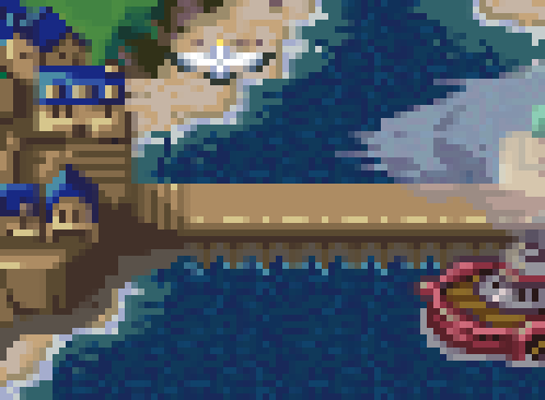
Option one is to just leave everything as-is. Granted, blown up on a huge monitor this doesn't look exactly fantastic -- pixels really weren't designed to be viewed at this scale. Here's a wider shot at 2:1 pixel scale, which depending on your device is probably a bit closer to how it appeared on an old 13" TV from 10 feet away:

So. Let's try some filters!
Here's the XBR 4x filter:
Here's the HQ 4x filter: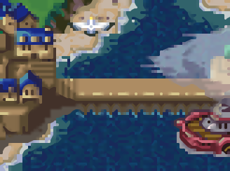
Mmmm, okay. Admittedly not great. But at least they're consistent.
These filters top out at 4X scale, so to get to 1080p you'd have to scale again, or you could just leave the screen with black borders. (Options are always good)
The trouble with filters is that there's only so much they can do. If you're upscaling anything beyond 2X, you really start to tear at the fabric of the original pixels. Still, I personally think that picking one filter, and applying it to the entire screen, looks better than haphazardly applying different styles to different elements within the same scene:
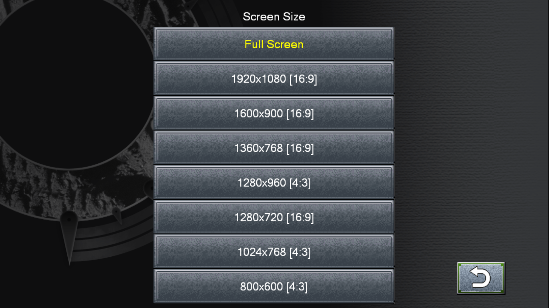
Ideally, the game would provide a solid options menu full of choices for pixel filtering style, scaling, scanlines, etc, but instead this is all we've got:
But the real tragedy here is that until someone makes some mod tools to undo some of this stuff, users cannot fix this themselves. I can't even run the game's raw pixel output through a 3rd-party visual tool to do custom post processing, because the output is corrupted with these artifacts.
(Help us Jed Lang, you're our only hope:)
FFVI Modding Tools: Remove Bilinear Filter: https://t.co/TlcaadnKoy
— Jed Lang ジェッドラン (@rivernyxx) February 18, 2018
Create Mods: https://t.co/BulVHAWXv2
Algorithms: https://t.co/vLgs7AE43T
Update March 2, 2018: Ask and ye shall receive! Jed releases a tool that fixes some of the issues.
But this is about a lot more than just filters. Once again, it looks like Square has been applying upscalers to the tile sheets themselves rather than the final output.
2. Thou Shalt Not Exacerbate Tile Boundaries with Upscaled Assets!
I talked about this in the original article, concerning artifacts like this in Final Fantasy V:
This problem is caused by two things -- 1) upscaling tilesheets before you compose them, and 2) the insecapable nature of pixel art itself.
Compose your tilesheets before you scale them
What do I mean by this?
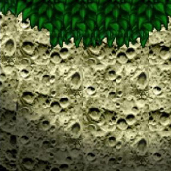
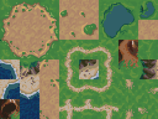
Here's a tilesheet dump from Chrono Trigger. Probably not exactly like the one Square used in this remake, but surely they had something similar:

Now let's run it through some random upscaler. It looks like Square used something like the HQ 2x filter, which will be close enough for this example.
Okay, maybe not perfect (I'd have preferred HQ4x or XBR myself), but pretty good, right?
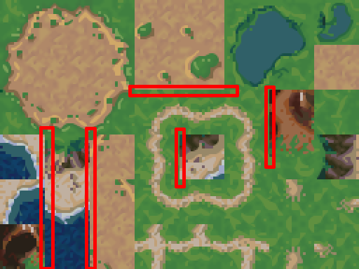
Well, not exactly. You see, upscalers look at neighboring pixels to decide how to draw things at a higher size. And when a tilesheet is all compacted like this, tiles inevitably get placed next to ones that they would never border in the actual game, yet those "false neighbors" will influence how the upscaled tile gets drawn. I've highlighted a few such locations below:
So in the game you have grass that looks like this:
And the seams stick out pretty clearly:
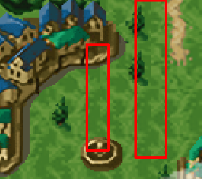
These seams don't have to be there, even with upscaling. The key is you need to take your tiles and put them in a natural mockup image with their true neighbor tiles, scale that as a finished image, extract tiles from that finished image, and piece them back