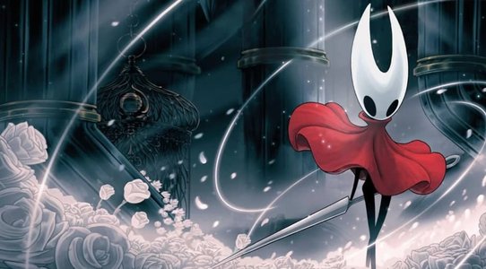
This year, Papers Please developer Lucas Pope released his latest game, the mercantile murder mystery Return of the Obra Dinn.
Recently, Pope was kind enough to join us on the GDC Twitch channel for a conversation about making Return of the Obra Dinn, where he talked about the harrowing engineering and design problems he had to overcome -- and how working to solve those problems is intensely appealing to him.
Solving a complicated 1-bit dithering issue
Pope: Papers Please was kind of a design first project where I had the idea for the mechanics. This one, Obra Dinn was visuals first, so more art focused. I wanted to make something 1-bit. And just kind of banging on that for a while ended up with this setting on the ship, and then after a few months, the core concept of figuring out how people died.
It’s basically me taking what I played as a kid, which was Macintosh Plus games which were 1-bit. For the time, they were actually high resolution. It was only 512x342 or something crazy like that, but it’s on a 9-inch screen so it's very sharp, very striking for me as a kid. And I played a lot of games that way. And I specifically remember never thinking—it’s hard to remember not thinking something—but for me I never thought, "I want more colors here." To me it always looked beautiful in one bit.
"I specifically remember never thinking...'I want more colors here.' To me it always looked beautiful in one bit."
And so Papers Please had some level of art in it, but it wasn’t really art-focused. And I like to pretend I’m an artist, so I thought what I wanted to do was take this 1-bit style that I played as a kid and try to make it legible and playable now using modern technology. So that was the idea. And then I mocked up a few things. What’s interesting to me is that the title screen for the game is the first thing I ever mocked up in one bit in Photoshop, and it’s also the first thing I made in Unity. It didn’t change in the entire four-and-a-half years. Basically, once I got that working it taught me that it was possible and it could look cool and that sent me four years down the line.
The first thing I did was I played some old actual Mac first-person games, and the best one I could find was something called Colony. And it’s a very low-poly, just-the-walls kind of thing. But one of the things from playing that game, and also playing some modern 1-bit games, [modern 1-bit games] take the render and they dither it, and it looks cool but you can’t see what’s going on. You can’t see anything in these modern games. In Colony you can see everything very clearly and I decided that everything is going to have an outline.
So geometric shapes are going to be outlined. If it’s against white it’ll have a black outline, if it’s against black it’ll have a white outline. So it’s always an inverse, so the shapes and geometry are always clear to see. So the thing about that is that it removes any mystery about where you are or the environment. Everything is perfectly defined, basically, which was fine because I wasn’t making a horror game, so I didn’t want to hide things from the player. You could tell where you were at all times, [which is] what I was going for. So that was on the surface, the simple thing, how could I make this work where everything is outlined.

But as the production progressed, the bigger problem became comfort--viewing comfort. Because you’ve only got two colors to work with and you need to make shades out of those using dithering. But dithering is not a technology that you want to use in a moving picture, basically because it gives you a headache, more or less. There’s too many high contrast, flashing pixels. So the real magic for me in making this work was solving that dithering problem and figuring out how to make it so people could play a four-hour game without getting massively uncomfortable.
The first solution is just to increase the resolution. So your pixels are smaller so that when you dither your eyes are fooled more into thinking it’s a tone instead of just a bunch of dots. I wanted it to be 1-bit but I also wanted it to be low-resolution. That was partly because of production—it makes it easier to create this thing when it’s not super high-res—but also I just like that style more. I like the low resolution, I like trying to do more with less pixels.
"The real magic for me in making this work was solving that dithering problem and figuring out how to make it so people could play a four-hour game without getting massively uncomfortable."
When I decided I couldn’t raise the resolution to solve that, I put off the problem for a long time, couple years, and then finally when I had enough to sort of sit down and play a lot of [the game] full-screen in front of me, I changed the dither pattern, basically. It wasn’t [about the dithering] trying to be shades so much as much as it was trying to be a wood cut, more pattern style. It worked fine to me, it looked ok, but in the Tigsource dev log which I kept for the game, nobody else liked it. Everyone hated it.
I went back to the drawing board and devised a dithering technique that keeps the dither sort of fixed when you’re looking around, so when you turn your head the dither pattern is not sliding across as you would expect; it’s moving with the scene. That took a lot of time to get right, and in the end you don’t really notice it. My hope is that you don’t get sick as much as you would have with the other one. I’m not gonna say I fixed everything, but it makes it much more comfortable to look at when you’re just standing there looking around.
The harrowing experience of scaling up from the 2014 Obra Dinn demo
Pope: I think there were four [characters] in the initial demo for this in 2014. That was easy. Whatever dialogue or characters or text I wrote then was with nothing else in mind. I didn’t have any of the story written at that time, just kind of "ok these guys will be fighting over something and the captain ends up killing a bunch of them or whatever." And that worked for the progress I’d made at that time. And I kind of stuck with this idea, that the game would be about figuring out how people died. I stuck with that for a long time, until I realized that that’s not hard to tell usually. You can usually see that pretty easily.
But it wasn’t until I had a lot more of the game done that I realized the real fun part would be figuring out who they are. Because that would lead into ways I could create clues in the environment and have the player kind of work out a Clue-like or Moriarty-like, it’s this old game, logic puzzle to figure out who people are.
So that design shifted. And that shift happened kind of late, I wanna say. Working out the narrative structure for this game was pretty tough, because you can only tell the story when somebody dies, first off, and then I also needed to have this almost unbroken chain of bodies going back through time which, you know, probably isn’t that normal.
I decided to break it all up into chapters or disasters and lay everything out like that. That structure was extremely difficult to figure out, which tied my hands a bit because I might have changed the design in a different way if I hadn’t put all that work into the story. But once I put all that work into the story, I was stuck with it and I had to figure out a way to make it work, and that way was basically the book, and focusing more on the identities than the means of death.
No tags.