It's that time again: to prepare for the big GDC 2018 Level Design Workshop on Tuesday, March 20th, a handful of the speakers wanted to warm up by chatting (via email) about some of the finer points of level design.
Gathering question from the community, they shared some interesting insights, experiences, and learnings in a shared document that's reprinted below for your reading pleasure.
The participants in this exchange, in no particular order, are:
Robert Yang, NYU video game professor and indie game maker
Blake Rebouche, senior quest designer at Guerrilla Games
Nina Freeman, level designer at Fullbright
Steve Gaynor, game designer and Fullbright cofounder
Heather Robertson, indie game maker
Mike Bithell, game designer and Bithell Games founder
Christopher Totten, game designer and founder of Pie for Breakfast Studios
David Shaver, game designer at Naughty Dog
Nathan Fouts, game designer and founder of Mommy's Best Games
[more detailed bios for everyone are at the end of the piece.]
Each participant was encouraged to respond to every question they felt comfortable answering, so you'll notice that the variety of answers will vary based on the query.
---------------------------
What tricks do you have to lead the player towards a goal?
This is always a big challenge, regardless of the genre of the game, there's a lot of cop-out's such as obnoxious goal HUD markers, but there's surely also a lot of different ways LD's can mitigate this, even solve it.
Robert Yang: I like using enclosed stairwells. As the player climbs upward, you’re getting them to look up -- and the opening at the top also frames the view for them. I also like the old Valve trick of using sudden flocks of birds to direct the eye, but then you need a bird system in your game?... There’s also two attitudes you can take: (1) it’s OK for the player to get lost sometimes, (2) players don’t actually mind obnoxious HUD markers, even if us developers think it’s artless.
Andrew Yoder: For multiplayer maps, I want the goal and the most mechanically engaging gameplay to be in the same space. When wide flank routes offer the best tactical options, gameplay can become diluted across the map, which creates “where’s my team?!” moments for anyone playing the objective. Also, because the goal in multiplayer games often shifts per situation, it helps to let players change paths and regroup with other players without having to backtrack (this is one reason why long hallways can feel bad).
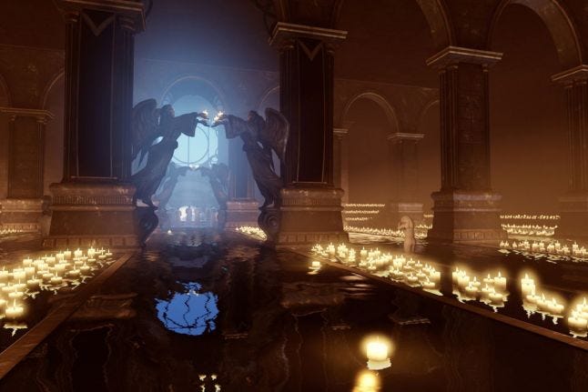
Chris Totten: Designers should reach into their visual art knowledge for ways to draw players through a space. Contrast is one of the best things to use. One example I demonstrated for students the other day was in Bioshock: Infinite: the designers used contrasting colors to indicate the path. The scenes in the beginning are predominantly blue/purple in lighting, but important points of interest are orange/yellow in color, which contrasts and draws players through the space. Other things to contrast include lighting (humans travel towards light instinctively), level geometry (small path leads to big space or tall object), or material/texture (indications of man-made objects in a natural area or vice-versa.)
David Shaver: It turns out, this is exactly what my GDC talk is about this year! I don’t want to spoil the talk too much, but here is a super quick version of some important tips. Combining several of these together gets great results.
Landmarks - Big, iconic objects in the world that orient the player and are often the end goal.
Lighting - Darken everything around the goal and put lights on it. People are drawn to the light.
Color - Pick a guide color that pops out from your environment color. Games like Uncharted and The Last of Us use the color yellow to let you know you’re on the right path. Yellow handholds, yellow flapping caution tape, yellow pipes, etc.
Shapes - Spiky shapes repel while round and square shapes provide safety and stability and attract.
Affordances - Affordances tell the player “hey, you can go here and interact with this thing” just by looking at them. They attract people.
Movement and Sound - Flying birds, flapping ribbon, fire, sparks, a banging door. All of these attract attention and can guide the eye where you want it to go.
Enemies & Buddies - NPC buddies can lead the way or look at an important object. People tend to follow enemies (or avoid, depending on the game type), so you can use them as breadcrumbs.
Breadcrumbs - Enemies to kill, powerups, health packs, collectibles. Whatever is appropriate for your game to breadcrumb the player through the level.
Heather Robertson: There’s a concept in theme park design called “weenies” -- i.e. large landmarks in the environment to which you make sure to give near-constant line of sight. This gives players a direct goal and a constant reference point with which to orient themselves. If that fails, there’s no shame in just putting signs with big arrows on them around your level. Players will get the idea, and it’s much better than leaving them lost in my opinion.
Nathan Fouts: In our current game, Pig Eat Ball, it’s a top-down 2D action-adventure game. The overworld sections are many screens wide and high. In 2D, we don’t get the benefit of large landmarks that are always visible by simply looking up and around as in 3D.
Instead, for Pig Eat Ball at least, we tried “pathway flooring”. The overworlds are open and the player can go many places to explore, but for the “critical path” parts, we use different floors that make a literal path to the next, necessary section.
Yet after years of testing, we found for some players that wasn’t enough! They’d still get lost. So we simply went for it--Every 5 seconds a tasteful HUD arrow fades in, pointing the way for a few seconds, and then fades out.
It helped many players since, in testing, and hopefully isn’t too obnoxious to players who just want to explore for a while.
How would you factor in player choice at a more fundamental level inside the game world? Would you agree that building a world that can hold many ld stories, as opposed to having one story and building the world around it, is a more advantageous way to design levels?
David: In order to factor in more player choice, you can include a variety of game mechanics into the level design and have multiple paths that let the player discover and use them. Dishonored does a fantastic job with this. You could stealth around on the ground, teleport to higher vantage points, sneak through small crevices, go in guns blazing, etc. The levels are like sandboxes that let the player accomplish the goal however they want with whatever tools (mechanics) they think to use.
I don’t really agree that building a world that holds many Id stories is inherently better, though. It all depends on the kind of game you’re making and the kind of tone you’re going for in that level. For example, if you have a bombastic action sequence where you are trying to escape a deadly helicopter, presenting choice can cause people to pause or go the wrong way which kills the action and pacing.
How do you balance gameplay vs aesthetic goals?
Chris: Rather than think of them as distinct from one another, I try to think how my aesthetics help accomplish gameplay goals. Think of environment art as the words or characters of a language and level design as the conversation you’re having with the player in the language. If I want players to go to a specific place or do a specific thing, I make sure the environment art or other visual elements that I use (lighting, geometry, textures) communicate to the player, “go here” or “do this.”
David: As a designer, gameplay often comes first over aesthetics. However, aesthetics are a big part of what makes games so amazing and must be considered too. The key to balancing the two comes down to good collaboration between art and design. It’s the artists’ jobs to make the game look as stunning, and it’s the designers’ jobs to ensure the gameplay is fun. Through close collaboration and a little compromise, we can make sure that aesthetics look amazing but still reinforce the gameplay so everybody is happy.
Heather: The two are absolutely intertwined; better aesthetics nearly always translates to better gameplay through readability and encouraging exploration.
Nathan: Like Heather said, they are deeply connected. For me, they actually feed inspiration. I’ll think “I need a block that damages the player.” I’ll then theme the visuals to the setting. In the case of Pig Eat Ball, it’s sci-fi, so I decided for some strikin
No tags.