Cuphead's titular cup-shaped head runneth over.
The run 'n gun adventure developed by Studio MDHR released at the end of September after facing several delays. It went on to sell over a million copies in two weeks.
The game has stirred debate over the role of difficulty in video games. But no conversation about Cuphead can avoid touching on its astonishingly accurate evocation of the look and feel of the cartoons of the 1930s.
The wobbly/rubbery motions, the appealingly rounded main characters and the bizarre adversaries, the abrupt shifts from cutesy to surreal and unsettling... everything about the game's aesthetic is a perfect recreation of the FDR-era output of Disney or Fleischer Brothers animation studio.
How was it done? And did the developers, who were initially a three-person team, realize what a world of hurt they were in for, tackling such a specific and demanding source material?
Chad Moldenhauer, creative director at Studio MDHR, talked us through their process, and their deep commitment to capturing every nuance of their source material.
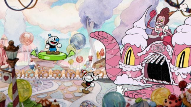
Hitting upon a unique art style
"We just jokingly said, 'Hey, why don't we just make a game look like 1930s cartoons, since that's is one of our favorite animation styles of all time?'"
The team at Studio MDHR went through several different styles before they hit upon the signature aesthetic. One approach would have had the game initially looking like preschool art, and as players continued on the art would gradually improve, as if the artist was maturing.
The 1930s cartoon look that they settled on, however, originally started as a joke.
"We just jokingly said, 'Hey, why don't we just make a game look like 1930s cartoons, since that's is one of our favorite animation styles of all time. Let's just try it, as a laugh,'" Moldenhauer says. "So, we pulled in some Mickey Mouse and some Popeye and made this kind of Frankenstein pieced-together scenes."
The response from the people they showed was so enthusiastic that they decided to pursue the concept.
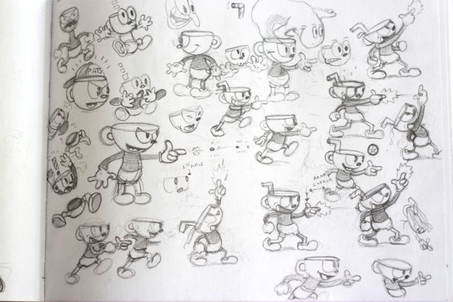
Embracing the classic art style, including the flaws
"We studied the line weights, how the thickness of the tapers would change from frame to frame on all of the old cartoons. We mimicked that to the best of our ability. "
To create Cuphead's animation, everything was first drawn on paper. Then instead of inking and painting on a cel -- as traditionally done -- they inked on paper and added color digitally. (The team did try a cel test, but found that it didn't make much difference in game.)
"That saved us a ton of time, and was probably a major contributor to why we were eventually able to finish the game," Moldenhauer says.
Another key to capturing the feel of the classic Depression-era toons was exacting recreations of the technical imperfects of the era. "If you go back and study old film—not just cartoons, any old film from the period—nothing was perfect," Moldenhauer says. "It's nothing like the digital crispness we're used to."
"We studied the line weights, how the thickness of the tapers would change from frame to frame on all of the old cartoons," he adds. "We mimicked that to the best of our ability."
Focusing was imperfect as well in classic films, so everything in Cuphead is slightly blurred.
Incorporating elements from classic toons beyond just animation
"The dust and the hairs and all of that noise is like, real life stuff. It's actually scanned from film, it's not digital."
But, aside from just the art inspiration, there was another element from that era that the team implemented in Cuphead. Moldenhauer mentioned how film used to have a lot of noise and scratches on it. Fittingly, Cuphead has on-screen noise and for such effects, it literally borrows from film.
"It's actually scanned from film, it's not digital ... the dust and the hairs and all of that noise is like, real life stuff," Moldenhauer says.
The details didn't stop there, however. They recreated old typefaces, and also designed custom fonts based on lettering from 1930s comics, as well as animation and film title cards.
No tags.


