Here’s an interesting challenge for you – convey to the player over 10 different game states without breaking immersion. Strike a balance between player control and suspense, between clear communication and immersion. Do all of that without making the player feel like they’re walking around with a plane dashboard strapped to their head. Let’s see if we can solve that challenge, learn from and improve The Long Dark.
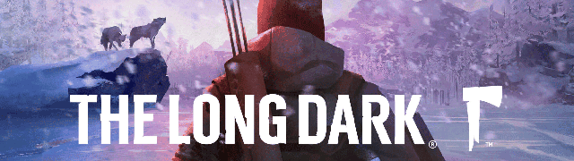
The Long Dark is a “first-person post-disaster survival experience set in the Northern wilderness” by Hinterland Studio. It aims to simulate real world survival conditions and captures the feeling of desperation, exploration and solitude. It stands out from the sea of survival games thanks to its unique painted visual style, slow meditative atmosphere and great level of polish.
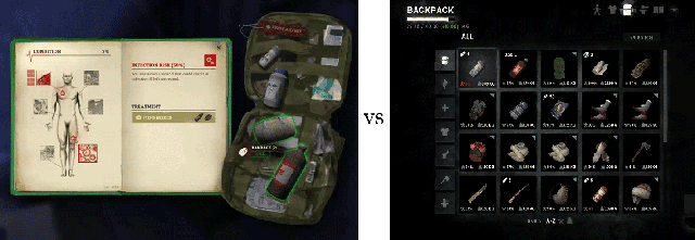
The game UX and UI went through several iterations before release and are still being tweaked. Visual presentation started in the “simulating physical objects” camp, with books and backpack images for inventory screens. After 4 years, it’s firmly in the minimalism camp, with icons and presentation only hinting at chalkboard drawings visual style.
The Basics of “The Long Dark”
Themes and Ideas: survival, solitude, despair, end of the world, quiet, cold, hunger, nature vs man, struggle, exploration.
Interaction type: direct control over character.
Camera type: first-person 3D.
In-game Time: Real-time, day/night cycles. No pause button - game pauses only in menu.
Main screens: HUD, inventory.
Win state: None.
Fail state: Health bar reaches 0.
Fun Factor: Immersion, challenge, resource scavenging and management, exploration.
How is challenge created: scarcity of resources, multiple needs that deplete over time and need to be filled, limited carry capacity, danger posed by weather and predators, large game map with varied terrain and scattered interest points, slow movement speed.
Visual Elements: 3D objects.
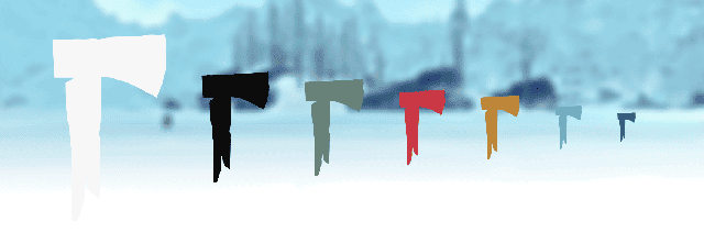
Visual presentation: winter color scheme with shades of black, white and blue, unique game font, uppercase text, minimalism, “chalk and blackboard” style UI elements, emphasis on numbers and progress bars, watercolor painted look of textures, stylized 3D objects, predominantly angular shapes, even lighting, sparse shadows, silhouettes.
Color: winter color scheme, shades of black and white toned with shades of blue, scarce use of red, yellow, blue-green.
Font: Created specifically for the game. Most text labels are uppercase. Description text lowercase.
Games with similar elements: Far Cry 3, The Forest.
Font and color
The game world is dominated by shades of blue and white, with varying levels of brightness. This creates a unique challenge for the UI, since it must be legible on both extremely bright and dark surfaces. A two-color approach is used to solve this. Solid white is used in almost all the UI elements, with black providing contrast for different backgrounds.
Accent colors are kept cool, toned down and used very sparingly. You can see the reasoning for this approach when colored UI elements are on screen. They do not provide enough contrast and are often hard to notice at a smaller size. This coupled with the goal of keeping UI unobtrusive and concentrating on immersion, made the developers remove all unnecessary elements, color, backgrounds and decorations from the game.
A lot of the game information is presented in the form of text. The developers created a custom font with varying letter height and different styles that look good in many roles. Most of the time text is in caps, with regular style used for details, notes and additional information. Color is used to communicate text importance, while font style plays a supporting role in this task.
There are several important lessons we can take away from these design decisions:
Keep your UI and in-game visual style in synch and complementing each other
Don’t be afraid to try several different approaches to find the best one for your game
Color doesn’t have to be a part of your UI design if it doesn’t add anything
Immersion doesn’t have to mean use of real-world objects as UI elements
Aim for better user experience and usability over UI aesthetics
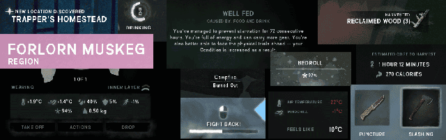
HUD
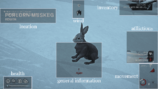
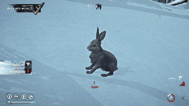
Many Heads-Up Display elements are contextual and some can even be set to fade out over time. The UI can be split in to 7 screen zones: location, wind, inventory, affliction, movement, general information and health.
Location zone briefly displays names of regions and places you have entered and indicates when you discover a new location. Wind zone shows you indicators for wind changes. If you stand in a wind protected area or you start to attract predators an icon will appear to indicate that. Inventory zone displays messages related to changes in inventory, like harvested materials or items expiring. Affliction zone displays messages for the many afflictions you can aquire or get cured from. Movement has a number of icons to indicate running/stamina, crouching, standing on an incline, weight status, weapon status and others. General information seems to show notifications for a number of events, like ice cracking under you, badges, bonus conditions etc.
Health zone is one of the only persistent UI elements on the screen, since the 5 status indicators are crucial to player survival in the game. Warmth, fatigue, thirst, hunger and condition along with rising/falling indicators are displayed here.
Red is used sparingly, but expertly to indicate danger/damage/warnings. It’s there in the incline icon to help the player understand that it’s a bad thing, without adding text to it. It’s there when one of the character needs runs out, like warmth or hunger. The universal color to indicate danger, it helps to convey the icon’s impact at a glance.
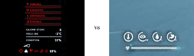
Another useful thing we can learn is how to maximize the use of bar indicators. Wrapping health bars in to a circle can save space. It also makes the UI more visually appealing, with icons large and easy to understand quickly. Notice the lack of numbers that we are accustomed to seeing with bar UI elements. They can still be found in the inventory, but in the HUD there is no need for them. Numbers take more time to read, when all the player needs to understand is if a certain condition is high/low, going up/down.
All UI element groups have their own style to help differentiate between them. Region text is larger than location text to indicate the size of the area. Predator attraction icon is bigger and more prominent than wind protection icon to indicate importance. Afflictions are colored differently to indicate importance – red for damage, yellow for warning, white for minor importance. Every aspect of UI design color/transparency/texture/size/shape is used to communicate with the player effectively.
Considering that this game has been evolving and changing over many years, it has an impressively good interface. You can see how having a general plan for the UI location, behavior and style helped the game stay useful and visually appealing. No matter how systems change or what new features are added, having a plan can help your designs do the same. This prevents the UI elements becoming a glaring patchwork of text and icons that don't quite fit together or overcrowd the screen.
The lessons here are:
Use the psychology of color to your advantage to indicate states, emotions, impact and importance
Get creative with progress bars, using different shapes for a more interesting effect
Use visual styles to indicate information type for a better user experience
Plan your UI strategy early and keep to it as new features and elements get added
What can we improve in this HUD design?
Let’s start with element location. The top left corner of the screen will get the most attention. It’s currently wasted on location names. Information that is not crucial to gameplay and can be found in the map screen – lowering its importance even further. There are much more important p