User experience design is cornerstone of, basically, any computer system, including, but not limited to different operational systems, business software and, of course, games. Now I see how you rolled your eyes and directed mouse arrow to the “close” button of the article. But, please, wait a second! Even if you think of UX as something alien to game design, you may benefit from the article itself.
So, why do we, game enthusiasts and developers, may apply UX design principles to assess our games usability and accessibility? One of the vivid examples, is how developers may apply heuristic evaluation methods to evaluate and change Event system of a game was told during GDC 2017 UX summit. Principles, that underlie UX design are universal, and based on studying of human heuristics, biases and other cognitive functions. That`s why a one may use these principles to design better products. If you are still in doubts, you may read about few misconceptions about UX in video games or watch several videos on the topic.
In the following article I would like to apply ideas behind the already mentioned heuristic evaluation to assess possible drawbacks of Pack store of one specific game - Star Wars Galaxy of Heroes by Electronic Arts.
Heuristic evaluation is a process of identifying usability issues in the UI of a software application, the game in our case, via using so called heuristics or, in other words, a set of certain principles.
The method was introduced by Jacob Nielsen more than 20 years ago and has been widely used since then. Several other researchers and practitioners also presented their principles and classifications. We will use particularly the last one, classification which was introduced by Susan Weinschenk and Dean Barker. Why this, but not the initial, Nielsen`s one? It`s based on several researches done by authors and unite best practices from Nielsen`s, Apple and Microsoft guidelines, so it seems to be more up to date and comprehensive comparing to initial guide.
Before we start I need to mention that HE is not a magic wand and if a one may conduct, for example, a playtest with independent users who may provide their feedback they should use all possibilities and don't use HE on it`s own. Another drawback of this methodology is that one person is not enough to cover all possible existing problems, i.e. it`s somehow opinion-based and only a group of professionals with different backgrounds may find as many issues as possible. You will need at least 3 persons to make evaluation process effective. So, let's start.
First of all we will take a brief look on the UI layout of the Store and then go step by step thru 20 points of the HE list and applying them to the UI and UX of the Pack Store of SW: GoH.
UI of the Pack store consist of two main parts:
1. Entry point from the Main Menu of the game:

1.1 Main Menu of the game
Store - is exact what we are interested in, it`s a place where all packs are being sold. Red circle with number one means that one free Pack is available.
Shipments - this is a store where individual items placed. Like separate shards for collecting characters, modules, tickets for automatic mission completion etc.
2. Store itself.

1. 2 Data Cards section of the Store and its entry Menu
Data Cards - section where all Bundles are placed, including IAPs, HC and SC priced, as well as Free;

1.3 Example of different packs: IAP, HC and SC respectively
Resources - a place where one may find resource packs, HC priced;

1.4 Several resource packs
Crystals - IAP store where HC is being sold
1.5 Example of HC packs: subscription on the left and two regular ones
And now, when you have some understanding of Store in the game we will start our evaluation.
1. User Control: The interface will allow the user to perceive that they are in control and will allow appropriate control.
There is no problems with User Control in the game. I.e. user may freely navigate and tap on each of the elements of the Store. I found no issues with this point.
2. Human Limitations: The interface will not overload the user’s cognitive, visual, auditory, tactile, or motor limits.
The UI doesn't overload human limitations, but it pushes users to make unnecessary calculations and cognitive efforts. Here is example.

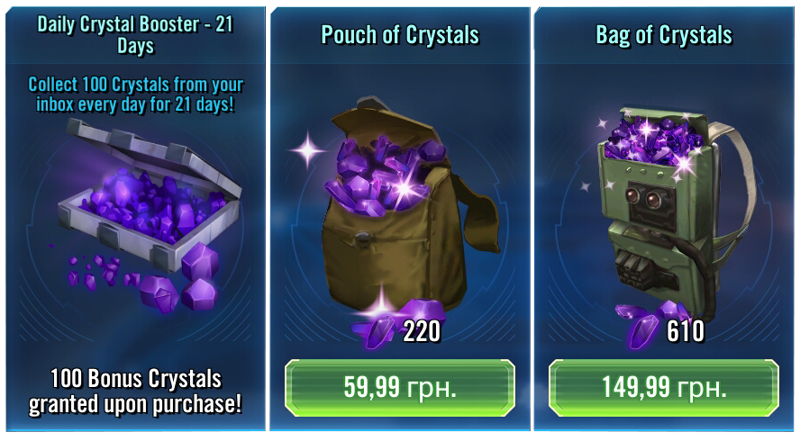
1.6 HC Packs: Subscription, lowest pack, highest pack
The game, like any other F2P game, offers several IAP packs with HC, starting from the cheapest $2 to the most expensive $100 one, and each next pack gives to a user more HC per one dollar spent. The first pack gives 110 HC per dollar and the last last one around 157 HC, or 30% more. But the game gives no clues on it. A user needs to make this calculations on his own and I think it`s not the best way to spend a one`s cognitive efforts, while they may be used for something more fun - gameplay itself.
Moreover, the game does have mechanics to present benefit from purchasing, for example, Daily Crystal Booster. On tap on the Booster icon the pop-up appears which clearly state how much more HC a user will earn upon purchase. At the same time nothing happens when you tap on HC pack, i.e. no pop-ups appear, the only action you can do - tap on a button with a price and purchase it.

1.7 Daily Crystals Booster (Subscription) pop-up
Solution for this controversial flow is simple - to add visual tag that would indicate benefit from purchasing one or another pack. Moreover, the game already has them! For example, that`s how some of the resource packs look like

1.8 Resource packs with Discount layout
So, the only actions that is needed to be done is to apply similar mechanics on IAP packs.
3. Modal Integrity: The interface will fit individual tasks within whatever modality is being used: auditory, visual, or motor/kinesthetic.
Audio modality in Store packs play very minor and supportive role and doesn't involve directly to the purchase process. Visual modality is ok as well and doesn't require any complicated or confusing actions.
4. Accommodation: The interface will fit the way each user group works and thinks.
The game doesn't use any specific UI layouts that would be familiar to some group and totally alien to any other.
5. Linguistic Clarity: The interface will communicate as efficiently as possible.
The game tries to communicate with users and explain what they will get upon purchase one or another Pack.

1.9 Example of explanation menu of an IAP Pack
6. Aesthetic Integrity: The interface will have an attractive and appropriate design.
Overall, aesthetics of the Store follows game style and doesn't contradicts with it. All existing badges and visual layout looks stylish and doesn't overwhelm a user with different colors or shapes. Though, some minor changes may be applied to improve visual perception of some information. For example, on the picture 1.9 you may find example of IAP Pack layout, including white pricing text on the white frame visual. While this white frame is used to distinguish IAP Pack from HC Pack that has the same character on it, except the frame and price, some solutions like special button may be used to highlight the difference in price/currency of packs.
7. Simplicity: The interface will present elements simply.
There are no complicated elements in the UI and UX of the Store.
8. Predictability: The interface will behave in a manner such that users can accurately predict what will happen next.
In the most cases actions lead to what you expect on tap - redirection to another menu, pop-up appearance, activation of IAP. Though, sometimes different outcomes happen on tap in the same sub-menu, but this mainly touches one of the next points - Consistency, which we will take look on in a few moments.
9. Interpretation: The interface will make reasonable guesses about what the user is trying to do.
I didn't face any issues with “bad guessing” interface in the game at all, not only in the Store.
10. Accuracy: The interface will be free from errors.
The Store doesn't contain any errors.
11. Technical Clarity: The interface will have the highest possible fidelity.
The Store UI fulfills this point as well.
12. Flexibility: The interface will allow the user to adjust the design for custom use.
Usually, games doesn`t allow users to customize interfaces of the Store and it`s something that would be unnecessary. I.e. there is no obvious reasons for such functionality and many possible technical issues that may occur if users will start to tweak elements of the Store.
13. Fulfillment: The interface will provide a satisfying user experience.
While overall experience is ok, there is some irritating moments. For example, there is one separate pack, gacha-based Bronzium Data Card, that may be purchased for one of SC types that exist in the game, Ally points, and it may be opened for free 5 times a day with some short time in between.

1.10 Bronzium Data Cards: Free and paid respectively
And each time if a user wants to open this Free pack, he needs to scroll thru all other packs in the section, what can be kinda frustrating, especially during some Time-limited sales, when overall number of packs may be more than ten. Due to this I`ve stopped to open these free packs, i.e. trade off between the reward (minor) and necessity to scroll thru several other packs that are not interesting to me is not in favour of Free pack. While I may assume that such solution was introduced to push users to check special offers every time they enter the Shop, but it seems not very user-friendly on a long-term run. Some packs may be live for several weeks and dig thru them for several times a day is not something that average user would like to do.
The most obvious solution in this case would be to move Free pack in the beginning of the section. I.e. when the pack is available to be opened for free - move it to the first position in the list. In this case users still we see part of exclusive offers but will not have to scroll thru them each time.