Before I get into the meat of this article, I’d like to offer a little context for our situation. Moth Likely is a brand new micro-game crafting studio based in Melbourne, Australia. Adrian Tosello and I officially formed the company in May while working on a number of prototypes. At that time it was our intention to explore potential aesthetics and themes that we are interested in crafting our brand and titles around. After a few months of prototyping and discussion, we realised that although making games we are passionate about is important to us (after all, creative expression is why we’ve both chosen to strike out on our own) we also need to validate the sustainability of our intended business model.
With this in mind, we set ourselves some goals: establish whether we can turn around a relatively polished game in 2 months; discover how hard it is to get a game of this scale on iOS in 2018; figure out how hard it is to implement opt-in advertising and in-app-purchases; collect data on what kind of organic reach we have as an unknown company and use this game to test a number of marketing methods/ platforms post-launch.
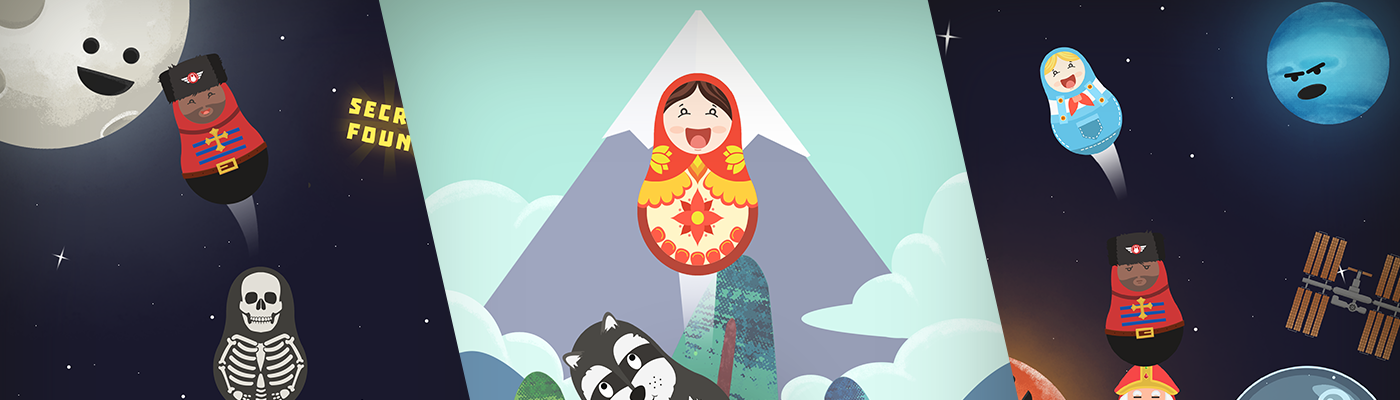
Here's the part where I shill the game for “context”! If you’d like to see the final product before reading on, you can download Oshka for free on iOS devices. For those after a TL:DP (too long didn’t play) version, Oshka is free-to-play, endless Russian Matryoshka doll stacker with a cute and minimal folk-art aesthetic. The goal of the player is to stack their Matryoshka as high as possible, collecting coins along the way to unlock new doll skins, with a secondary goal of exploring outer space and finding Easter eggs for the intrepid stacker.
Circumstance
It maybe goes without saying, but as a tiny company in its infancy, we weren't in any position to expend significant resources by purchasing data, nor did we have a backlog of titles to look at for guidance. Understanding our position and respecting our limitations, the goal of this project was to create something really small that would allow us to validate our business model. Additionally, we imposed a number of limitations on ourselves; those being a 2-month development timeline, a child-friendly aesthetic, a single touch input mechanism, as little text as possible and a portrait locked experience to allow for single-handed play. All of these decisions loosely followed our core organisational values, the main one being accessibility.
Compromise
Perhaps the most obvious thing about taking on a project this short and with such tight financial limitation is the sheer number of compromises we knew we would need to make. Coming into a 2-month project, we were very aware that our scope would need to be tiny. We knew to expect unexpected disruptions, design issues stemming from a lack of planning time, necessary but unplanned iteration and unforeseen systems we might need to include to address platform requirements, just to name a few. To experienced game developers this might sound obvious, but I’ve always considered game development to be an exercise in compromise, and my reason for outlining our more notable ones below is simply to give you an idea of what kind of compromises you may need to make taking on a similar project scale and timeline.
Throw unique mechanics out the window
Unique and exciting mechanics usually mean more upfront design, time required to implement, iteration cycles and testing time. We went with an automatic wobble on the dolls which required us to only need to check for a single tap input to trigger the doll launch. Our thought process here was with less time designing an overly complex system up front, the more time we’d have to implement and experiment with it.
Pick a simple art style and stick to it
Despite wanting to initially go down the path of a painterly traditional folk-art vibe for Oshka, I realised if we wanted to get it out the door in 2 months I’d need to simplify the style and make it as easy as I could to generate new art assets. This didn’t mean I had to skip the folk aesthetic entirely, but it did change how I approached things. To keep our art scope down we:
Created a single doll template in Photoshop and started with that for every doll
Set up a doll prefab with a generic open/ close and launch animation in engine (meaning we could replace the doll sprites easily and use the same animations on each doll)
Limited doll facial expressions to an idle, happy and angry animation (only adding unique expressions to dolls that required them)
Didn’t create any fancy transitions or animations if they didn’t drastically improve the experience
Used an out of the box free font that suited the aesthetic and reused the same UI assets as much as possible
Picked a relatively limited palette and tried to keep art detail as low as made sense
Crush your insecurities and perfectionist tendencies
Admittedly I struggled harder with this than Adrian did — he had spent the previous year doing a game a day/ week/ month regularly and had beaten his perfectionism down better than I had. In most cases we had to be comfortable making do with the first or second version of whatever it was we were doing, be that doll art, environment art, system implementation, etc… every time we found ourselves wanting to revise something we had to ask “is this worth it?”, “does leaving it as is impact our core goals?” and “will the benefit of this revision be measurable to us after launch?”
Cut content to MVP only
Initially we had planned for 15 unlockable doll skins at launch. Every few days we would revise this number based on how quickly I was getting through creating them, how much play time it was looking like it would take to unlock them and how much time it would take to implement them as in-app-purchases/ coin unlockable shop items. We also heavily cut down on how many environment Easter eggs we had planned for launch. Sure they might have been a nice polish addition, but most of our players wouldn’t ever see them.
Build a working system ASAP over an overly polished one
When Adrian was putting together the main stacking mechanic, he quickly built a system that validated our idea of how it would work. This system met our needs at that moment which as far as we were concerned would serve us until the end of the project. With more time and planning the code could have been cleaner, but what was most important here was that it simply worked.
Go against what you believe is the best design implementation for one that works just fine
Of all of the compromises we made, this one was the hardest. We were pretty certain that this game needed a near miss mechanic and we tried to implement this a few different ways. Binary systems can be boring and frustrating. It is a well-known fact that success and failure is more meaningful when there’s a chance of an outcome that isn’t quite either — like small wins during major jackpots to encourage you to gamble again the next time. We got stuck on the best way to add a near miss mechanic for two weeks mid development and it became apparent that the systems we were trying would take too long to implement. Despite it being a more interesting design, we bit the bullet and cut our near miss system in favour of the simplicity of what we already had. We felt the near miss mechanic wasn’t ultimately going to impact our core goals of assessing market viability given our means for this project.
Mistakes made and lessons learned
More design upfront = less wasted time on iteration required later
A short project means less time for marketing during development, which in turn means fewer people know that it’s coming and are less willing to support you at launch
We didn’t define the people we were making this for early enough or in enough detail, which meant we weren’t sure how to market it until later in development
Set up UI scaling/ UI prefabs FIRST THING and don’t deviate from this standard. This would have saved us a few days of UI fix ups mid way through development.
Test it on more people as early as possible. Regular feedback from a variety of people will make sure it is as clear and enjoyable to interact with as we can make it.
App size not optimised anywhere near as much as we could have, meaning wifi connection was suggested to download on launch (can’t measure how much impact this had, but our impressions vs installs may point to this being a pretty big issue)
What did we do right?
Set and maintained healthy and realistic expectations (didn’t expect a financial return quickly, didn’t expect a feature or media coverage, focused on collecting data as a tool to make better choices next time over all else)
Kept our core goals front and centre and used them as a lens through which we could validate all decision making
Polished to an acceptable level given our competition already in the market