Despite being a fairly mediocre artist, I get a lot of comments and compliments on the artwork and visual design in Ikenfell. This makes me very happy, of course. Obviously, those who dislike it are much less likely to say so to me personally, but I love that lots of people are very receptive to the look and style of the game. I’ve been asked several times to talk about my approach to the pixel art, and what kinds of rules, palettes, and inspirations I use for the game. So this will be a large, orderless, and rambling post about all of that!
Outline
About Ikenfell
Perspective
Inspiration
Colours
Process
Characters
Portraits & Dialogue
Battles
1. About Ikenfell
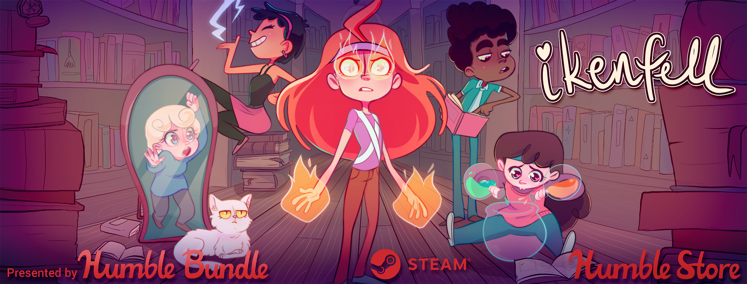
Ikenfell is a heartwarming turn-based RPG about a school of magic and its troublesome students. It is currently in active development, and we're aiming for a 2018 release on Steam and the Humble Store. Humble Bundle Inc. is publishing the game.
Official Website / Official Press Kit
If you write about the game in a blog or article, please use assets from the official press kit!
A note about "good" pixel art
As with most art styles, there is a lot of contention about what good pixel art is and what best practices should be. I follow some general guidelines, but most of what I do is from just repeatedly doing lots of pixel art and tweaking my style until I get the results I desire. A lot of amazing pixel artists produce work that is far beyond my capabilities, but I do the best I can within my limits.
This overview is not about how to make good or popular pixel art, it is about my design decisions regarding my own game, my inspiration, and my reasoning behind them.
Now, let’s begin!
2. Perspective
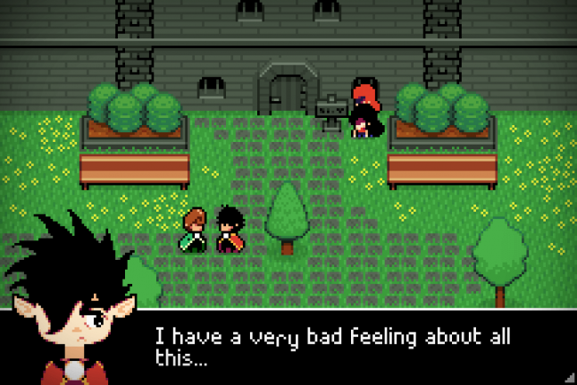
Ikenfell’s camera, like a lot of 2D games (especially RPGs), has a birds-eye view of the game world.
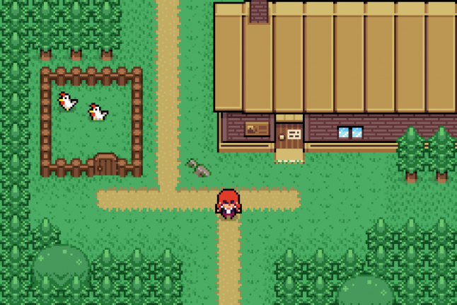
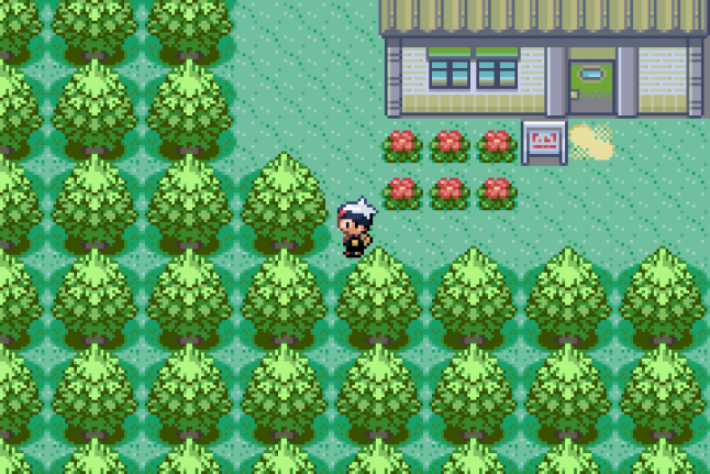
The camera is looking down at the world, if you imagined it in 3D, at about ~60 degrees (this is a rough estimate, in this screenshot alone you can see I am very liberal with the actual angle of objects). The projection is orthographic, meaning that as objects get further away from the camera, they do not actually look smaller (as in real life), they are “flattened” onto the screen.
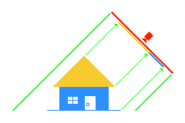 Often game developers will just make 2D games and take all this for granted, and just draw the art, but I like to think about camera and perspective a lot, as it’s one of the key relationships in the game between the player and the world itself. Knowing the details of this relationship can make the difference sometime when you’re making a visual design decision, as even technical details can help you highlight where and when it’s most important to break these rules.
3. Inspiration
Ikenfell’s visual design is inspired by several games. I found a screenshot from each game that was relatively similar to the Ikenfell screenshot I posted above, so you can easily see where I drew ideas from each!
Link's Awakening
I love Link's Awakening’s extremely reserved use of tiles, and efficiency with space. Every room has an interesting shape, the background tiles use a very minimal amount of antialiasing to occasionally introduce interesting shapes and curves, and rooms are often reduced to their very basic ideas. But you don’t want multiple rooms to feel the exact same, and Link’s Awakening does this wonderfully. Here’s a simple 4-screen graveyard in the game:
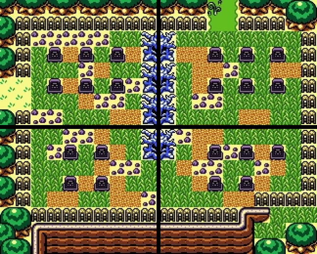
This simple area is wonderful. You get an off-purple colour and haunted trees to give you a sense of unease (ghosts will pop out of graves and attack you, but the visuals make you ready for it). The little rubble tiles and weedy overgrowth convey that this is an old, run-down graveyard, not well-kept. The cliff in the bottom screens gives you a sense of location (the graveyard is on a raised-up plateau, giving some sense of the burial rites of whoever owned these graves). The exits to the left and top have different terrain types, indicating that this graveyard is a bridge from one area to another, so we know we’re leaving our previous location. And, finally, despite the 4-rooms containing all the same elements, they are each differently shaped and detailed. You have multiple paths to walk through each room, so there is no correct path, just a strange haunting area to navigate through (while avoiding mean ghosts).
I could talk this much about every single screen in Link’s Awakening, so I’ll stop now, but this kind of overthinking is what drives a lot of Ikenfell’s inspiration. What a gorgeous game.
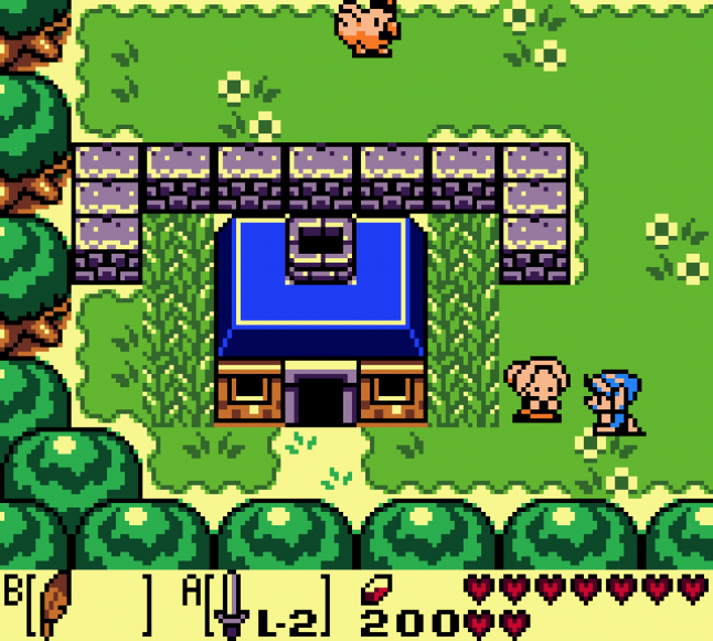
Pokemon Ruby/Sapphire
While I am not particularly fond of the character designs (or the pixel art in general) of Pokemon Ruby/Sapphire, I do like their buildings and interiors a lot, so they served as inspiration for a lot of Ikenfell’s architecture.
I like how, to create the least amount of view-obstructing details, these games often just eliminate the side and bottom walls of interiors. In this screenshot, there’s some subtle shadows on the side to give a sense of the ceiling’s height, and the bare minimum amount of details scattered about to give a sense of this character’s lifestyle:
Interiors were often cramped, but so many buildings in this game have completely unique artwork, which was very inspiring. When a building or a house looked completely different from others, I was always inspired to search it, and it was always pleasing to explore its interior with its wonderful new details. This bike shop, with its tiled floor, yellow/orange highlights, thin interior walls, and details scattered about was such a cool looking little area:

This game inspired me to research dozens and dozens of building styles and designs, and always to try to make new houses, buildings, and interiors look and feel distinct.
Mother 3
The simple lines, bold flat blocks of color, and almost childish flat look of Mother 3 wonderfully disguises its immense cleverness and wonderful use of space. I thought this game was a huge step-up visually from Earthbound, and if, after playing, you go back and just look at a few rooms, you start to see how nicely arranged a lot of them truly are.
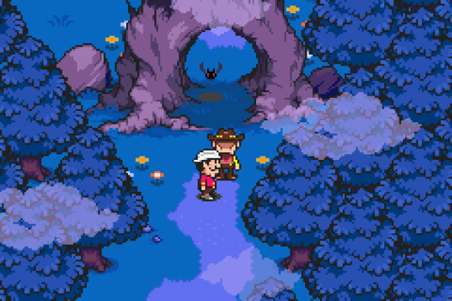
Just like in the above screenshot, this screenshot below shows another night-time scene. Rather than use a real lighting system (difficult on a small system like the GBA), the game uses beautiful blue/purple palettes for dark areas.
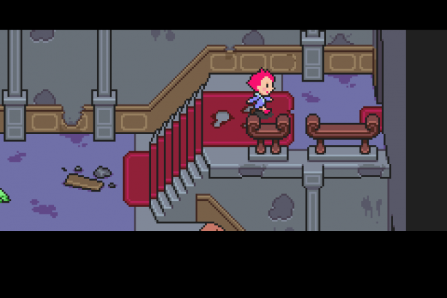
The game just has this wonderful way of breaking up monotony as well. In the next screenshot, it’s a simple room with a stairway leading up to a door. But the building is run-down, so they create little 3D indents in the walls, break off pieces of the siding, carpet the stairs, stain the walls, and just create a series of interesting edges that turn a room that would look very boring into a very visually appealing place to walk through. All you have to do here is hold right, but somehow it feels like so much more, this place has a history and you can feel it down to its very skeleton.
The dark outlines around characters and objects in Ikenfell is very inspired by Mother 3, as well as the bold colours and inner-edge lighting. If you look at this side-by-side comparison (Mother 3 on the left, Ikenfell on the right), you can see how solid objects have dark outlines at their edges, but edges inside the sprite use a highlight colour instead, rather than another dark line cutting across them.
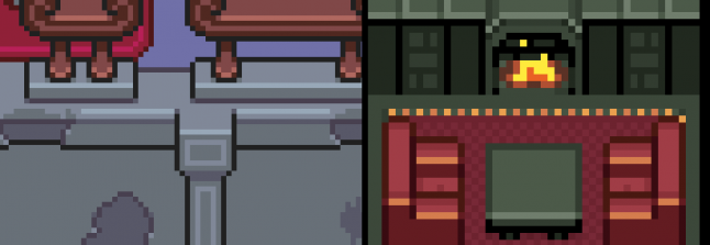
I really like how minimal this is, makes objects seem whole, and gives a strong sense of shape and body to things without cluttering them up with detail. If all the edges of an object use dark line, even in their interior, they tend to look really messy and ugly when done at such a low resolution.