Recently, there has been discussion in the Overwatch community about the game needing big changes in order for it to remain exciting and reduce toxicity. Here enters Role Queue (RQ), a new matchmaking system dubbed ‘Overwatch 2.0’.
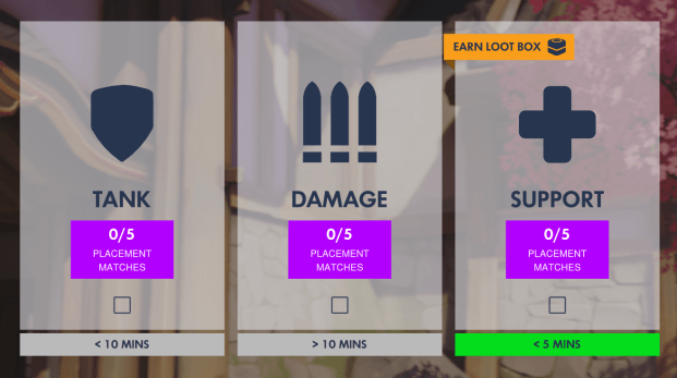
Role Queue layout
It works so that before a match starts, players will choose which role they wish to play (tank, damage or support). Each of these will have separate queues with their own waiting times. The match making system will then work to match 2 tanks, 2 damage heroes and 2 supports to create a fixed 2-2-2 team formation. Once a game is found where the chosen role is needed, players will only be able select heroes within their pre-selected roles. Players will need to play five placement matches for each role to get a seasonal skill rating (SR) for each competitive season. Therefore, they will end up with 3 separate SR, one for each role.
At the moment this feature is only present in the current beta competitive season, however in September it will be live in full on competitive and quick play modes. Because it’s a big change, getting the UX right is essential. The aim is not to tutorialise this feature in the traditional sense of “do x to get y outcome” and instead have players teach themselves through understanding content provided and making their own decisions. Here are some of the UX considerations that were (probably) made:
Visual Hierarchies
There are two types hierarchies here and both are laid out based on the order information and actions should be considered and their importance. Because people tend to read from top to bottom, the most needed initial content by the player is higher up which grabs their attention first. For instance within each role box, people will read content in the order of “this is my role and this is how many placement matches I have left”. If they’re happy with that they then click the check box and press ‘ready’ to confirm. This encourages them to go through a logical thought process and feel informed.
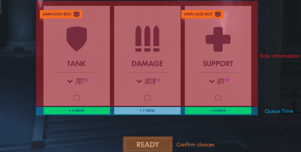
Hierarchy A: Showcasing core information
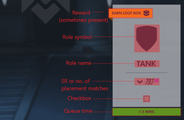
Hierarchy B: More detailed information
Essentially, the first hierarchy (A) we see reflects the player’s high level thoughts, referring to essential information needed to play (“which roles can I play? How long will it take me to get into a match with it”) and the primary goal of getting into a match. The second is concerned with further information for secondary concerns of each role like increasing SR and doing all placement matches (B).
Minimal text
Colour and symbols are able to convey a lot of information, reducing the need for text resulting in a less cluttered interface and less cognitive power utilised. This relates to the two types of decision making systems we have: system 1 (quick, unconscious, automatic) and system 2 (slow, effortful, calculating). Players who are new to RQ are likely to read all the information on the screen which is lengthy and effortful due to using the system 2 mode of thought. However, the way colour and symbols are used here directs attention to certain areas whilst filtering out the rest, encouraging the use of system 1 thinking, where most text is skipped whilst, still taking in the most important information needed.
Going from the top down they know: symbol = role type, purple sr = current points, green time box = can quickly get into a match, check box = pick this option, greyed out ‘orange’ button = I can’t continue till I choose a role, orange buttons = “do this”.
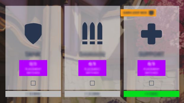
Without text, players still can understand their tasks
This is great from an accessibility standpoint as it accommodates for different types of players as well as levels of comfort with the role queue process. Those who want more information can take the time to do so, however those who only care about role and time or have been through the queuing process before, can quickly pick and confirm their choice.
The value of text should not be dismissed as it still provides a purpose and a basis to player tasks.
Encouraging recognition over recall
A key usability heuristic is that people find it easier to recognise things they have experienced rather than having to recall them. Recognition contexts tend to provide more cues that help in remembering and recalling information quickly. This aids learnability of the game as it minimises the cognitive energy needed to remember something and so the player is less distracted, allowing them to maintain their attention on the gameplay itself.
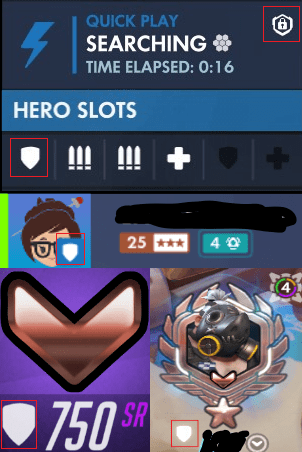 Keeping consistency (usability principle) helps players become familiar with objects over time and don’t need to force recall in case they forget, which alleviates stress and reduces time wasted. In RQ it’s observed with the same visual hierarchy of role selection in competitive and the ‘Find Group’ section. Also the use of symbols related to role type before, during and after matches. Shown in the image below, taking the example of the ‘tank’ symbol, it’s seen on: the role selection and character selection screens, by the player avatar, in the ‘find group’ section and after a game when the new SR is shown.
Player SR is shown after a match and on on the main role selection page so that they can compare SR’s between roles without needing to remember them from the top of their head.
Repeated use of role symbol across multiple screens
Clear UI and interactions
Making UI usable involves four dimensions: learnability, efficiency, simplicity and aesthetic. There are often trade-offs between these however the aesthetics of a game is hugely influential to how the player engages with it.
The aesthetic-usability-effect suggests that attractive interfaces are percieved as more usable. Aesthetically pleasing objects elicit positive emotional responses enabling the user to think more creatively and find out what they need to do. The UI therefore can guide the UX of a task by directing where to look and what to interact with, using visual and audio tools like colour and animation to give feedback. The feedback helps players understand the rules and limitations of their experience.
A good example of feedback in RQ is that the role boxes turn white and include a tick when they are clicked on. Selecting the check boxes does this too meaning that the checkbox is an indicator or learning tool, working to guide the player into interacting with the role box to make a selection. Because they can tap anywhere within the boundaries on a role, players can select an option quickly and go into games faster which is their main goal. Anything that helps them get through the queuing process quickly and efficiently is helpful.
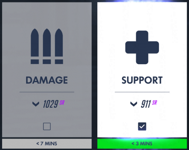
Left: not chosen / Right: selected role
Things that encourage players to pick a certain option are usually a different colour, contrasting with the neutral vibe of the queueing screen (navy / light grey) to help them pop and direct player gaze. Namely, yellow indicates rewards and green represents a quick time. Both objects are used outside or ontop of role boxes because they play a big role in decision making and appeal to instant gratification. SR is in purple to show what current scores are per role which can influence choices made e.g. pick a role because the SR is low and want to do better.
Using Gestalt principles for easier comprehension
There is a lot of new information players are going to be taking in, to prevent cognitive overload, breaking down content into manageable chunks can avoid overwhelming them and provide clarity.
One way to categorise content is to apply Gestalt principles (of visual perception). These are about how people see objects which can be used to engage users in different ways. For instance, the law of common region posits that elements that are related are placed in a shared area with a boundary. In this case we see 3 large separate rectangles at the centre of the screen, which are all about the roles. The visible outlines of the rectangles enable the player to assume that each box has information only pertaining to its stated role. This is more suitable than a table layout which would be less clear, require more time to read, and take up unnecessary space. Though this may seem rudimentary, organising things into groups means users can isolate and consider them separately.
Rewards for playing certain roles
Rewards are used to incentivise an even distribution of players across roles and reduce wait times.
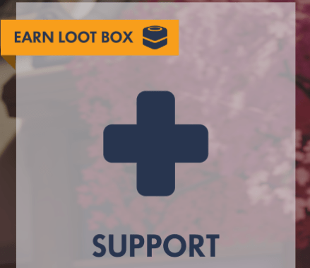
Rewards are always on the top left of role options
Credits and loot boxes are associated with in demand roles (usually Support and Tank), serving as positive reinforcement, so that those roles are played often and associate them with being rewarding. It creates value in them, normalising playing a variety of roles rather than the more popular one: DPS. Such engagement – contingent incentives make the player’s time and effort feel worth it, providing meaning to their game play.


